ATI
ATI Government Solutions is a start-up IT company that provides services to the U.S. Government. The company was looking to do a subtle rebrand and enlisted ROYALTRI’s help to ensure all logo changes were strategic and consistent with the company’s values and established image.
ATI’S logo spacing and alignments were updated using the Golden Triangle ratio. The typography was updated for better legibility and a new slogan was proposed. ROYALTRI also introduced a new colour palette to better highlight the company’s Native American ownership.
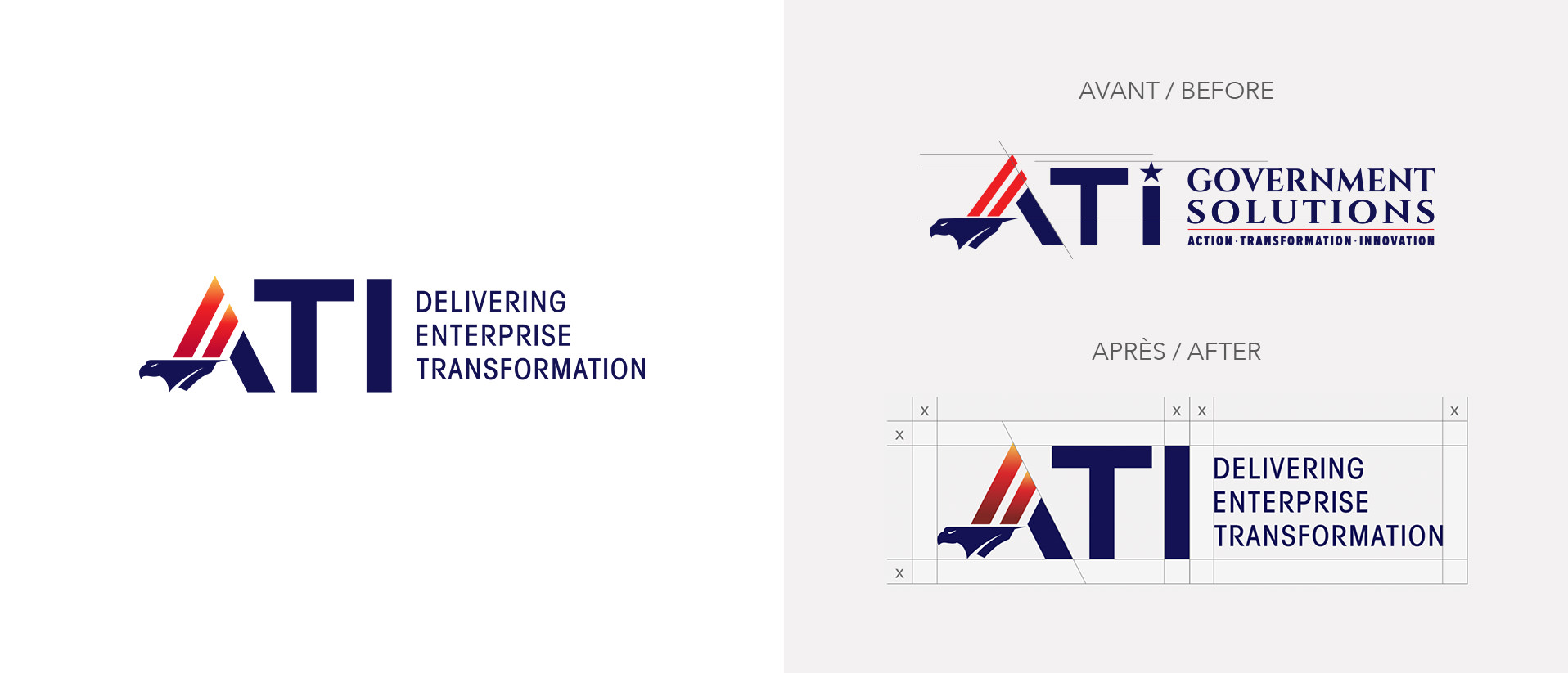
The bald eagle is the emblem of the United States and is considered, by Native Americans, to be a sacred creature. Because eagles fly higher than other birds, they are seen as being closer to the Creator - and therefore hold a special place in the folklore of the culture. The image of the eagle was a powerful element of ATI’s branding and ROYALTRI worked to incorporate it with other elements such as the stripes used to represent the U.S. flag which form the peak of the letter “A”. The gradient colours of the stripes include a creative combination of official U.S. government colours and from ATI’s affiliated Susanville Indian Rancheria.
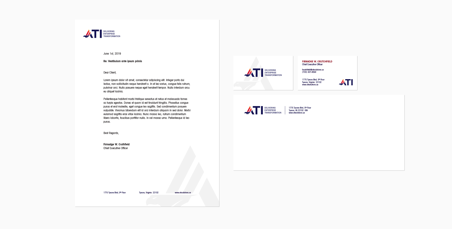
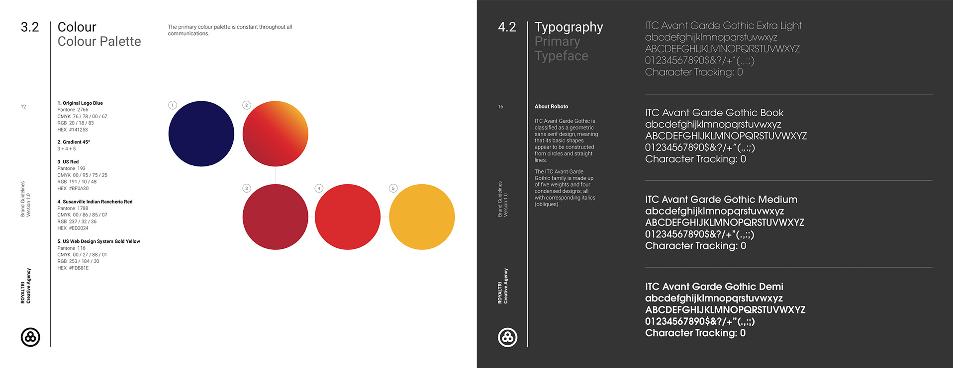
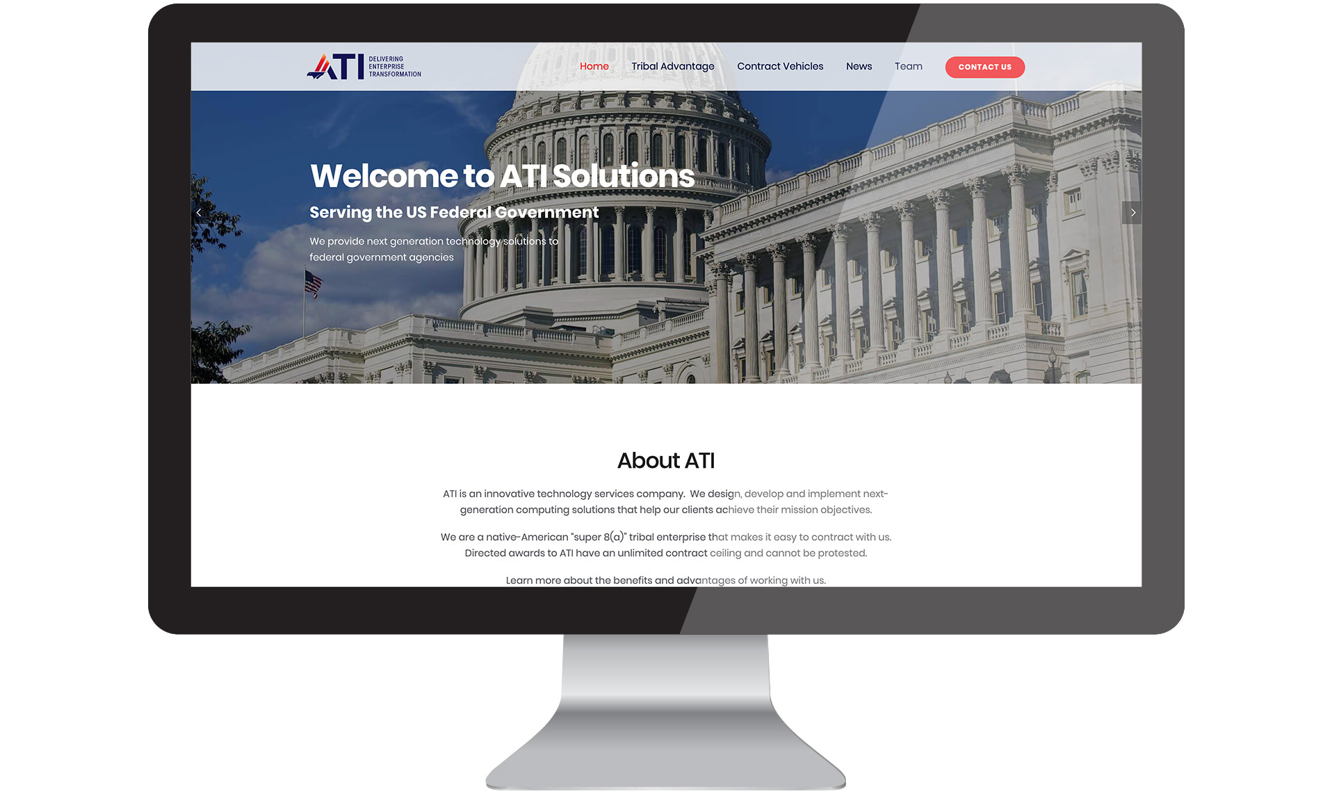
ROYALTRI provided ATI with an updated logomark, business cards, branded stationery (letterhead and envelopes) and a comprehensive brand book with guidelines for proper logo usage, colour palette and typography to ensure consistent use across all mediums. ATI’s WordPress website was updated with new brand visuals and the web content was reorganized for better information flow.
Website: www.atisolutions.us